
Hey, want to jazz up your home with bold colors? Try a moody blue office for a cozy vibe, or a playful pink laundry room to brighten chores. Go for deep hues in your living room for elegance, or a nature-inspired green kitchen for freshness. How about a soft blue bedroom for calm? Add bold statement walls for drama, or pastels in kids??spaces. Stick around to uncover more cool ideas!
Key Takeaways
- Transform living rooms with bold statement walls in electric blue for a striking focal point.
- Create a moody office using Sherwin Williams Foggy Day for a cozy, sophisticated vibe.
- Energize laundry rooms with playful pink like Sherwin Williams Cabbage Rose for vibrancy.
- Design elegant living spaces with deep hues like navy or emerald green for sophistication.
- Revamp kitchens with nature-inspired Pewter Green for a stylish, welcoming atmosphere.
Moody Blue Office Inspiration
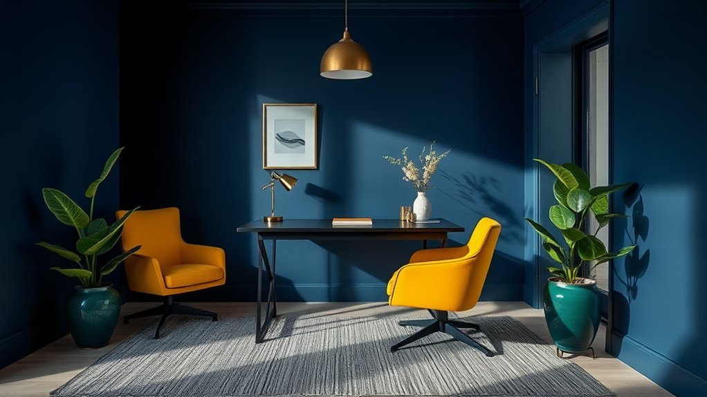
While you might think bold colors are risky, let? s plunge into a cool idea with a moody blue office. This color choice, inspired by a kitchen range, ties your home together with style.
Imagine painting your space with shades like Sherwin Williams Foggy Day or Rain. Pretty neat, right? Moody blue works wonders in small rooms, adding depth without feeling heavy or cramped. It? s like wrapping your office in a cozy, sophisticated blanket.
Want the perfect hue? Take a favorite item to the paint store for a color match. You? ll get that exact moody blue vibe you? re after.
Playful Pink Laundry Room With Cabbage Rose
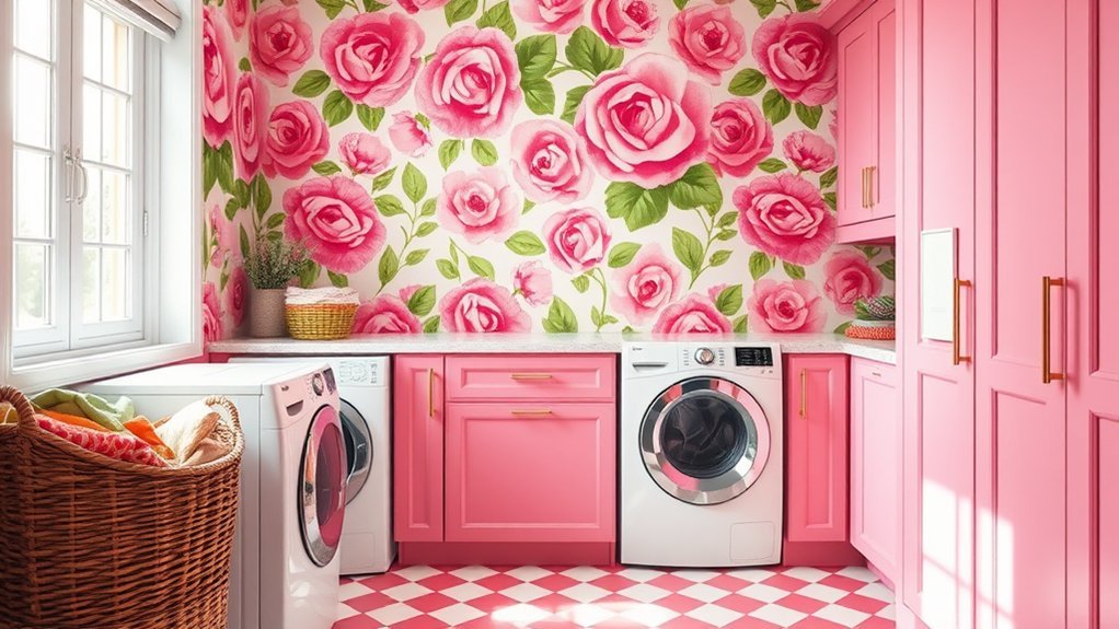
If you? re ready for a fun twist, let? s immerse ourselves in a playful pink laundry room.
Imagine transforming this space with Sherwin Williams Cabbage Rose, a vibrant shade that? s popping on Instagram. It? s not just pretty; it adds a cozy atmosphere, especially in tight spots.
Picture your space blooming with Sherwin Williams Cabbage Rose, a trendy pink that? s Instagram-famous and brings cozy charm to any nook.
This playful pink works as a closet and hallway off your bedroom, showing its flexibility.
Here? s why bold paint colors like Cabbage Rose rock in small rooms:
- *They make tiny spaces feel warm and inviting.*
- *They add a splash of personality without much effort.*
- *They pair well with neutral accents for balance.*
- *They turn boring chores into a fun vibe.*
Serene Pastel Touch in Kids’ Spaces
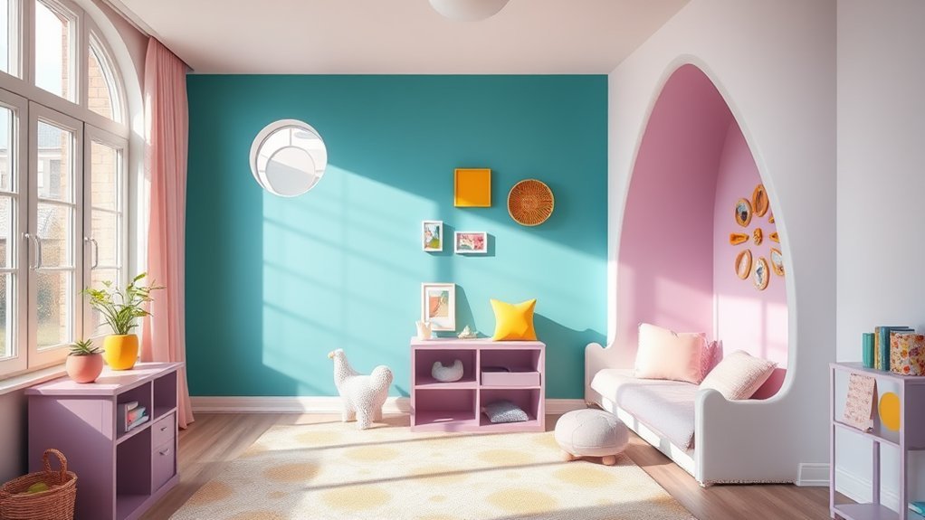
As you think about redesigning kids’ spaces, consider the magic of soft pastel colors. These shades, like pale lavender or soft pink, can create a calming atmosphere, perfect for nurseries or playrooms.
You? ll find they? re a gentle backdrop, letting vibrant decor, such as colorful toys or art, really pop without overwhelming. Ever tried pairing pastel blue with bold accents? It? s like a quiet lake with bright fish swimming? balanced and fun!
Why choose pastel colors? They? re versatile, adapting as your child grows, and they foster a peaceful vibe for creativity or rest.
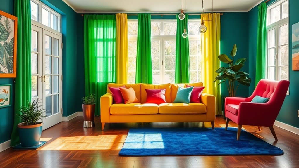
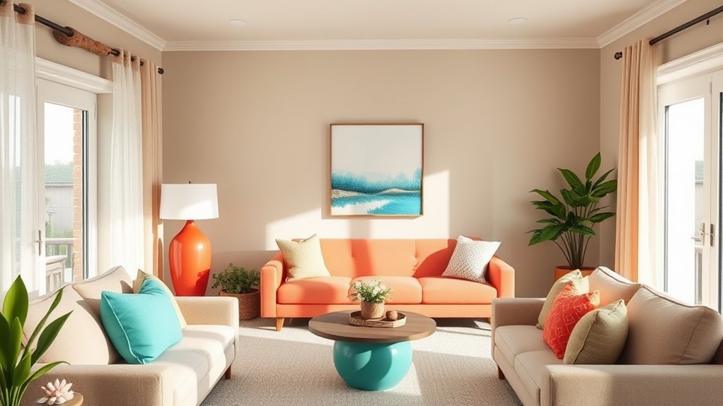
Elegant Living Room With Deep Hues
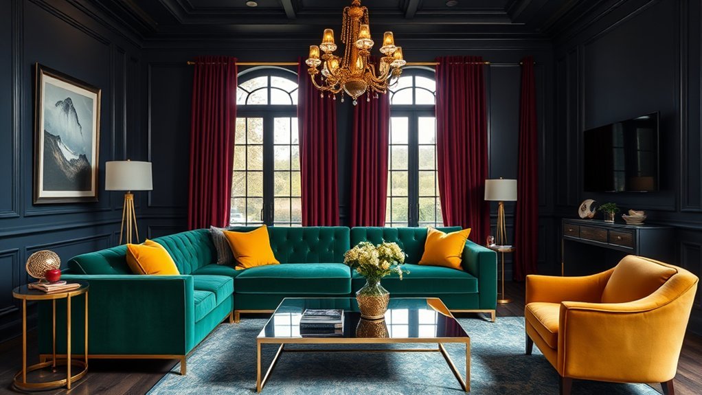
When you’re ready to transform your living room, consider diving into deep hues. These colors, like navy or emerald green, create an elegant atmosphere that? s downright classy. You can make a statement with a velvet sofa in jewel tones, setting a bold focal point.
Wanna know how to amp up the style? Check these ideas:
- Add white trim to make deep hues pop with contrast.
- Toss in metallic accents for a touch of shine.
- Layer throws and cushions with bold patterns for cozy vibes.
- Stick to one color family for a unified, slick look.
Think of it like painting a masterpiece? balance is key. For additional inspiration, explore stylish wall decor to elevate your space with a sophisticated touch. To create a warm workspace vibe, incorporate soft textures and ambient lighting inspired by cozy home office decor tips. Consider crafting a unique desk accessory with DIY office projects to personalize your space and boost creativity.
Nature-Inspired Kitchen in Pewter Green
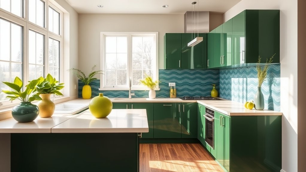
Three words can change your kitchen game: Pewter Green magic. This bold color, Sherwin Williams Pewter Green, brings a subtle, natural vibe to your space. It connects indoor and outdoor feels, especially when natural light pours in, highlighting its calming tone.
You? ll love how it transforms your kitchen into a stylish, welcoming spot for cooking or chilling.
Pair this color with wood or rattan textures, and you? ve got a nature-inspired look that? s hard to beat. It fits any style, from modern to rustic, so you can? t go wrong.
Want a fresh, functional kitchen with a bold edge? Try Pewter Green on cabinets or walls. Think of it like adding a forest? s calm to your home? simple, yet striking.
How will you use it?
Timeless Dining Room With Vintage Green
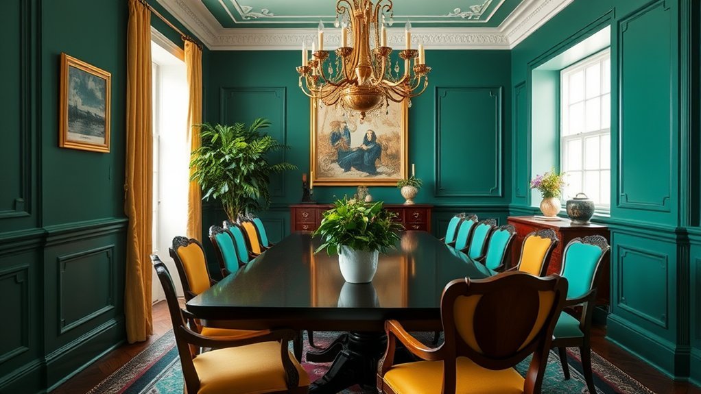
If you? re hunting for a dining room vibe that lasts, try Vintage Vogue Green. This shade of vintage green brings a timeless look, blending vibrant and enduring colors into your space.
It? s versatile, fitting both modern and traditional design styles with ease.
Wondering how to make vintage green pop in your dining room? Check these ideas:
- Pair it with natural wood accents for a warm, grounded feel.
- Add metallic finishes, like gold or brass, for a fancy touch.
- Use big swatches to test how colors shift with light.
- Mix in neutral tones to balance the bold vintage green shade.
This design choice creates a cozy spot for meals.
Cozy Guest Room Color Transformation
How about giving your guest room a fresh, inviting look with bold colors? You can transform your cozy guest room by painting the walls a deep green, like Sherwin Williams Pine Mountain, for warmth. Add furniture with bright fabrics as focal points, and see how the colors look amazing together. When decorating with bold shades, balance them with soft blues, like Sleepy Blue, for calm trim. Explore innovative ways to redesign your space with creative renovation ideas for a truly unique guest room. Consider incorporating affordable materials to keep your project cost-effective with budget-friendly renovation tips. As a beginner, start with simple projects like painting to build confidence in your DIY home remodel skills.
Check out this table for ideas:
| Color Idea | How to Use It |
|---|---|
| Deep Green Walls | Paint for a warm base |
| Bright Fabric Furniture | Add pop as a focal point |
| Soft Blue Trim | Use for a calming touch |
| Layered Lavender Shades | Mix tones for visual interest |
Isn? t it cool to mix and match like this? Layer shades, add wood textures, and you? re set!
Coastal Vibe With Subtle Evergreen Tones
While you’re thinking about revitalizing your home, why not try a coastal vibe with subtle evergreen tones?
Imagine transforming your space into a serene getaway, using Sherwin Williams Evergreen Fog. This color, with its green-blue hues, creates a tranquil atmosphere, perfect for bedrooms or quiet spots. It connects your indoors to nature? s beauty, and it? s not too bold. Additionally, this shade can inspire a refreshing update with coastal landscaping elements to bring the seaside charm right to your doorstep.
Envision your home as a peaceful retreat with Sherwin Williams Evergreen Fog, a green-blue shade that brings nature? s calm indoors effortlessly.
Here? s why Evergreen Fog works so well for a coastal vibe:
- It pairs nicely with wood and rattan, boosting that beachy feel.
- The soft hue reflects light, making rooms look welcoming.
- It balances brighter accents, so you? re not overwhelmed.
- It turns any space into a calming retreat, like a seaside escape.
- Consider extending this theme outdoors with patio garden designs to enhance the natural, coastal aesthetic.
You can also enhance this look by incorporating stunning landscaping ideas to create a seamless connection between your indoor and outdoor spaces.
Bold Statement Walls for Dramatic Impact
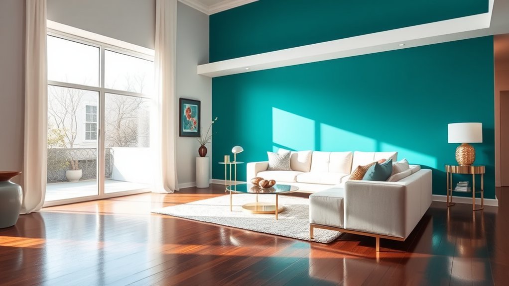
As you rethink your home? s style, consider bold statement walls for dramatic impact. These walls, with intense hues like electric blue, can transform your living room instantly. They draw the eye, creating a striking focal point. Wanna test it out? Start with a small accent wall, checking how the color looks with your room? s light. For an affordable twist, explore budget-friendly setup ideas to enhance your space without breaking the bank.
Pick color combinations that match your decor, like deep navy with bright accents, for balance. Look at jewel tones or muted bold shades for a classy vibe. Curious about options? Check this table for ideas:
| Color Choice | Best Paired With |
|---|---|
| Electric Blue | White Trim |
| Rich Tangerine | Neutral Furniture |
| Deep Navy | Vibrant Decor |
| Muted Emerald | Soft Grays |
See what fits your space! For a sustainable approach, explore eco-friendly renovation solutions to ensure your bold color choices align with environmentally conscious practices. Additionally, consider integrating budget-friendly landscaping ideas into your home? s exterior to complement the bold interior design with affordable outdoor enhancements.
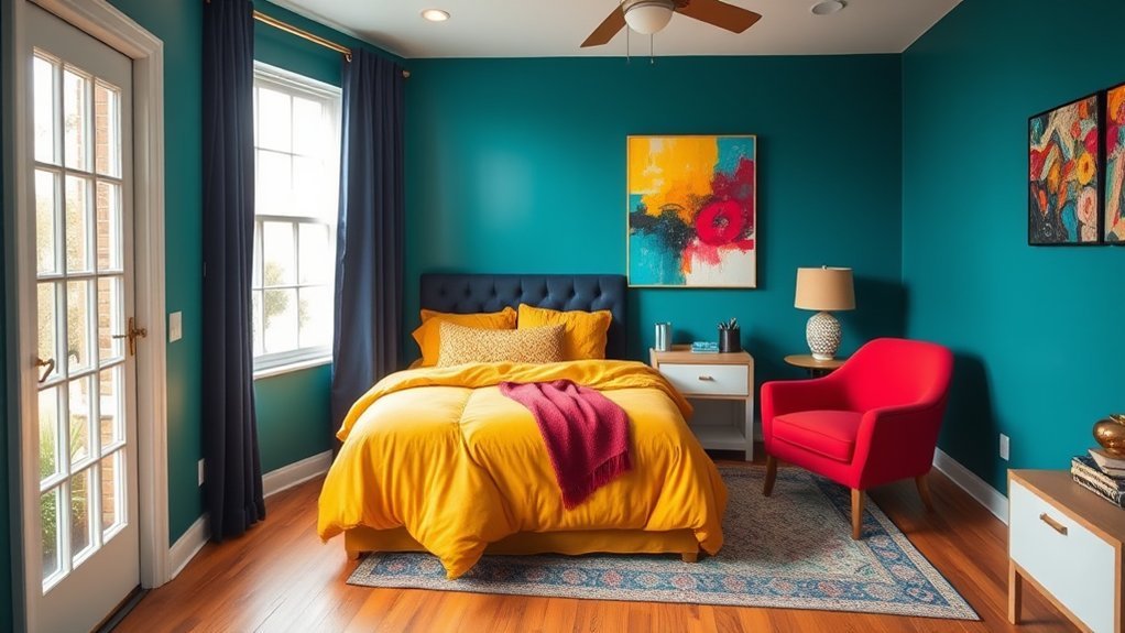
Soft Blue Retreat for Calming Ambiance
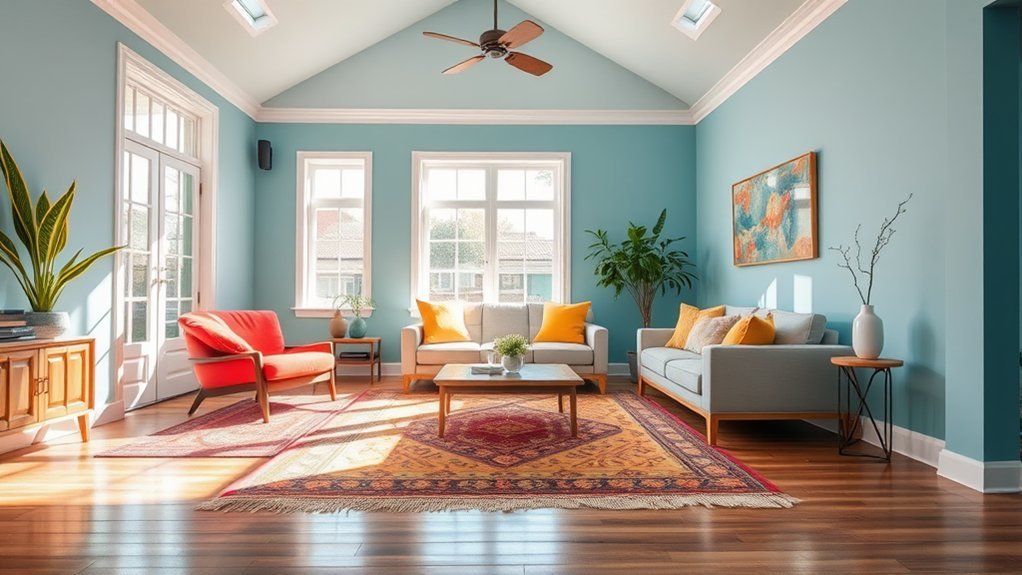
If you? re craving a peaceful spot in your home, try soft blue hues. They bring a calming ambiance, perfect for bedrooms or chill-out zones.
In interior design, soft blue shades, like Sherwin Williams Sleepy Blue, pair nicely with neutrals, making your space feel serene. Plus, they can trick the eye, making small rooms seem bigger and airier.
Wanna know why soft blue works so well? Check this out:
- It reflects natural light, brightening your space without harshness.
- It creates a soothing vibe, almost like a quiet lake.
- It? s easy to add through pillows, curtains, or walls.
- It keeps things fresh, not stuffy or boring.
Frequently Asked Questions
What Bold Colors Go Together?
Hey, when picking bold colors that go together, explore color pairings like emerald green and burnt orange. These complementary hues energize your space, and color psychology shows they boost mood and sophistication effortlessly!
What Is the 3 Color Rule in Interior Design?
Hey, you? ve gotta know the 3 Color Rule in interior design! Use color harmony techniques for balance, consider color psychology effects, and mix contrasting color palettes to create a cohesive, stunning space.
What Color Makes a House Look Expensive?
Wondering what color makes your house look expensive? Opt for luxury color palettes like deep navy or charcoal. These expensive color schemes create a sophisticated exterior, instantly elevating your home? s curb appeal and charm.
What Is the 60 30 10 Rule for Colors?
Imagine a canvas of life, where colors shape your mood. You? ve gotta grasp the 60-30-10 rule in color psychology. Use 60% dominant, 30% complementary colors, and 10% for accent walls. Balance awaits!
Conclusion
Hey, you? ve seen how bold colors can transform your home, right? Did you know that 75% of homeowners feel happier after adding vibrant shades to their spaces? That? s huge! It? s like giving your house a fresh, lively personality. So, why not try a pop of color yourself? Whether it? s a moody blue or playful pink, you can make a difference. What color would you pick to brighten your favorite room?